









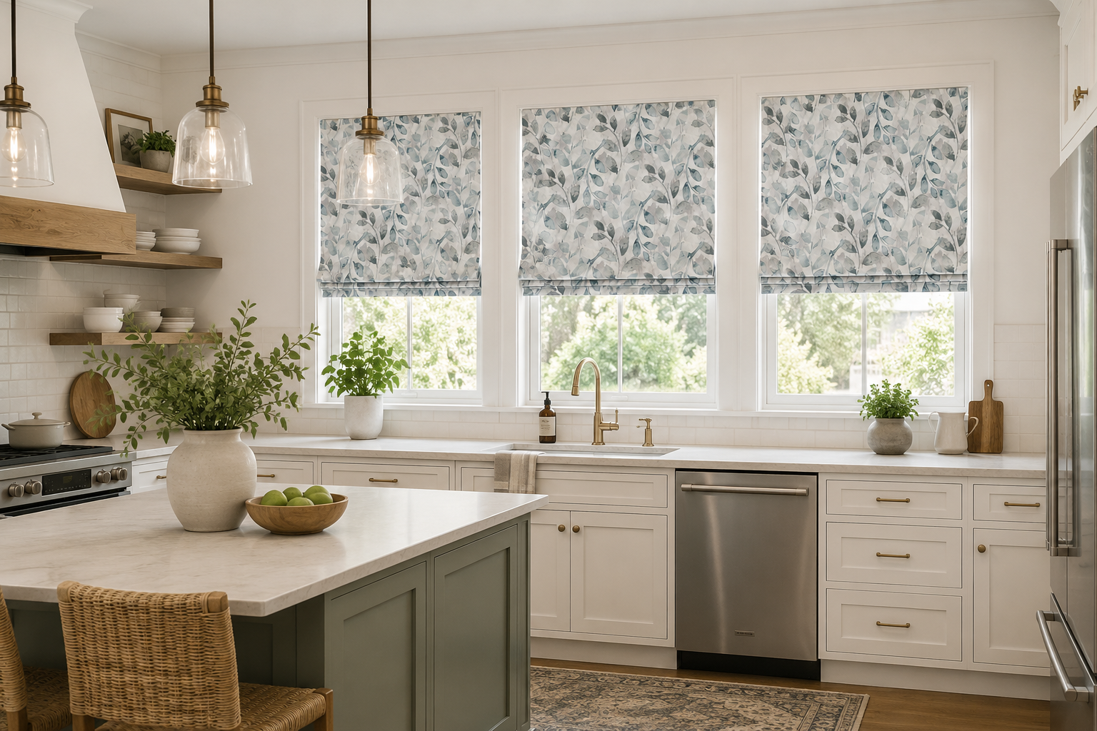
Explore current color trends for blinds and shades, including warm neutrals, earthy greens, calming blues, dark finishes and natural wood tones that can help update the look of your windows.
Window treatment colors are becoming warmer, softer and more connected to natural materials. While white blinds and shades remain a timeless choice, homeowners are increasingly considering warm creams, taupes, khakis, browns, greens, muted blues and richer wood finishes to add more depth and personality to a room.
The strongest color trends are not necessarily about choosing the boldest shade available. Many of today's interiors use subtle, layered colors that complement wood flooring, natural fabrics, warm metals and softer wall colors. Window treatments can either blend into this palette or provide intentional contrast around the window.
If you are ready to explore available colors, visit our Window Blinds & Shades by Color page to browse blinds and shades by finish. Because color can look different on a screen than it does in your home, we also recommend ordering samples and comparing them directly with your walls, trim, flooring and furnishings before making a final choice.
What Window Treatment Colors Are Trending?
Current interior color trends favor a combination of warm foundational neutrals and nature-inspired accent colors. Whites and creams are becoming softer and warmer, beige and khaki tones are returning, earthy browns are adding depth, and greens and blues continue to provide calming color without overwhelming the room.
At the darker end of the palette, black, charcoal and deep brown finishes are being used to create contrast around windows, particularly in modern interiors and rooms with darker window frames or architectural details.
| Color Trend | Overall Look | Pairs Well With | Good Rooms to Consider |
|---|---|---|---|
| Warm White & Cream | Soft, timeless and versatile | Warm trim, light wood, beige and natural fabrics | Living rooms, kitchens and bedrooms |
| Beige, Taupe & Khaki | Warm and grounded | Wood floors, linen, leather and earthy décor | Living rooms, family rooms and offices |
| Natural Wood Tones | Organic and textured | Wood furniture, stone and natural materials | Living rooms, dining rooms and kitchens |
| Earthy Green | Natural and calming | Cream, tan, wood and brass accents | Bedrooms, offices and living rooms |
| Muted Blue | Calm and relaxed | White, gray, natural wood and coastal décor | Bedrooms, bathrooms and home offices |
| Brown & Chocolate | Rich and sophisticated | Cream, tan, brass and warm wood | Dining rooms, offices and living rooms |
| Black & Charcoal | Bold and architectural | Black frames, white walls and modern interiors | Living rooms, offices and contemporary spaces |
1. Warm Whites, Creams and Off-Whites
White continues to be one of the most popular window treatment colors because it coordinates easily with trim and allows the treatment to blend into the architecture of the room. The trend, however, is moving toward softer whites and warmer off-whites rather than only bright, cool whites.
Why Warm Whites Are Popular
Warm white, ivory and cream tones can soften a room without introducing a strong color. They work especially well with warm wood flooring, beige furnishings, natural textiles and softer wall colors.
These shades also give homeowners flexibility because they can remain compatible when furniture or wall colors change later.
Browse white blinds and shades or cream and off-white blinds and shades to compare available finishes.
2. Beige, Taupe and Khaki Are Returning
Cool gray dominated interior design for years, but warmer neutrals are becoming more prominent. Beige, taupe, mushroom and khaki provide the versatility of a neutral while adding more warmth than a cool gray.
Why These Colors Work Well on Window Treatments
Window treatments cover a significant area when closed, so a warm neutral can influence the overall feel of the room without becoming an obvious accent color. Beige and taupe shades can bridge white trim, wood furniture and warmer walls particularly well.
These tones are also useful when you want the window covering to feel softer than a bright white treatment without making the windows a dramatic focal point.
Explore beige blinds and shades for warm neutral options.
3. Natural Wood Tones and Organic Finishes
Natural materials continue to influence interior design, making wood tones especially relevant for window treatments. Light oak, maple, medium brown and deeper walnut-inspired finishes can introduce warmth and texture without relying on a painted color.
Light Wood Finishes
Lighter wood tones create an airy, casual appearance and work particularly well with Scandinavian, transitional and organic-modern interiors. They coordinate naturally with cream, beige, soft green and warm white walls.
Explore maple blinds and oak blinds for lighter wood looks.
Dark Wood Finishes
Walnut, mahogany, chestnut and other dark finishes can bring greater contrast and visual weight to a room. They work especially well with leather, dark furniture, warm metals and traditional or sophisticated interiors.
Browse walnut blinds, mahogany blinds and cherry blinds to compare darker wood finishes.
4. Earthy and Muted Greens
Green continues to be an important interior color because it introduces color while still feeling connected to nature. Instead of bright greens, many current interiors favor sage, olive, moss and other muted botanical tones.
Why Green Works on Shades
A muted green window treatment can act almost like a neutral when paired with natural wood, cream, tan and stone. Green can also provide more personality than beige or white without dominating the room.
Green is especially appealing in bedrooms, home offices and living spaces where a softer, more relaxed environment is desired.
Browse green blinds and shades to see available shades and finishes.
5. Soft and Muted Blues
Blue remains a reliable decorating color, but softer and more muted blues are particularly easy to integrate into window treatments. Dusty blue, blue-gray and ocean-inspired shades provide color while maintaining a calm overall appearance.
Where Blue Window Treatments Work Well
Blue shades can work especially well in bedrooms, bathrooms, home offices and coastal-inspired rooms. They pair naturally with white trim, medium and light wood finishes, beige and warm neutral furnishings.
Darker navy tones can also provide more dramatic contrast in rooms that need a stronger architectural accent.
Explore blue blinds and shades for current options.
6. Brown Is Becoming a Design Color Again
Brown is moving beyond traditional wood finishes and becoming a stronger interior color in its own right. Chocolate, espresso, cocoa and warm medium browns can make a room feel grounded and sophisticated.
These colors work particularly well with cream, beige, warm whites, natural stone and brass or bronze accents.
Brown Blinds vs. Wood-Tone Blinds
A solid brown fabric shade creates a softer contemporary appearance, while stained wood or faux wood blinds introduce visible grain and architectural structure. Both can support the current movement toward warmer interiors.
For a richer look, explore our dark-finish blinds and shades.
7. Black and Charcoal for Strong Contrast
Black window treatments have become more common as black window frames, dark metal finishes and higher-contrast interiors have grown in popularity.
A black or charcoal blind can frame the view and make the window a more intentional design element rather than allowing it to disappear into the surrounding wall.
When Dark Window Treatments Work Best
Dark blinds and shades work particularly well when they repeat another dark element in the room, such as window frames, cabinet hardware, lighting fixtures or furniture.
They can also provide striking contrast against white or cream walls, but they should be considered in relation to the size of the room and the amount of natural light available.
Browse black blinds and shades or our gray blinds and shades for darker neutral options.
Is Gray Still Popular for Window Treatments?
Gray has not disappeared, but the way it is being used is changing. Cooler blue-based grays are increasingly giving way to warmer grays, mushroom tones and colors that sit between gray and beige.
If your home already uses cool gray walls, flooring or furnishings, a gray blind can still coordinate beautifully. There is no reason to replace a color that works with the existing room simply because a warmer trend is becoming more popular.
Choose the Undertone Carefully
Warm gray works well with beige, wood and cream, while cooler gray coordinates more naturally with blue, crisp white and cooler finishes. Comparing physical samples with your existing surfaces is much more reliable than relying on the word "gray" alone.
Explore gray blinds and shades to compare different tones.
8. Bronze, Copper and Warm Metallic Finishes
Warm metallic tones can add subtle richness to a room without requiring a bright color. Bronze and copper finishes work especially well with warm wood, tan, cream, black and earthy color palettes.
Metallic finishes are usually most effective when they coordinate with another element in the room, such as lighting, cabinet hardware, furniture or decorative accessories.
Explore bronze blinds and copper blinds for warm metallic options.
Should Trending Window Treatments Match the Trim?
Matching the window treatment to the trim remains one of the safest ways to create a clean and timeless appearance. White blinds with white trim, for example, allow the treatment to blend into the window rather than becoming a separate visual element.
However, current color trends give homeowners more freedom to treat the window covering as part of the room's overall palette.
Match the Trim When
- You want the window treatment to visually disappear.
- The trim is an important architectural feature.
- You prefer a timeless rather than trend-driven appearance.
- The room already contains several stronger colors or patterns.
Choose Contrast When
- You want to emphasize the window.
- You have black or dark window frames.
- You want to repeat another accent color in the room.
- The treatment itself is an important part of the design.
Should Blinds and Shades Match the Wall Color?
Window treatments do not have to exactly match the walls. In many rooms, choosing a shade slightly lighter or darker than the wall creates a more layered appearance.
For example, a warm cream shade can complement a beige wall, while a soft green shade can add subtle color to a warm neutral room.
The key is usually coordinating the undertones rather than finding an identical color.
Undertones Matter More Than the Color Name
Two blinds labeled white, beige, gray or brown can look completely different when placed next to each other because of their undertones.
Warm Undertones
Warm colors may contain cream, yellow, tan, red or brown undertones. They usually coordinate well with warm woods, beige walls and brass or bronze finishes.
Cool Undertones
Cool colors may contain blue, green or violet undertones. They often coordinate better with crisp whites, cool gray walls and silver-toned finishes.
This is one reason physical samples are so valuable. Hold the sample directly against the trim, wall and flooring rather than judging it independently.
Trending Window Treatment Colors by Room
Living Rooms
Warm white, cream, beige, taupe, natural wood and muted green are versatile choices for living rooms. Darker brown or black treatments can work well when the window is intended to become a focal point.
Bedrooms
Soft blue, muted green, cream and warm neutral shades can create a calmer look. If sleep and darkness are priorities, select the fabric opacity first and then choose a color that complements the room.
Kitchens
Warm white, cream, light wood and natural tones pair easily with many cabinet and countertop combinations. Darker treatments can provide contrast in kitchens with lighter cabinetry.
Bathrooms
White, cream, soft gray, blue and green can work well in bathrooms, but material selection should take priority in spaces with higher humidity.
Home Offices
Warm neutrals, blue, green and natural wood tones provide a professional but comfortable backdrop. If glare is an issue, consider the light-control characteristics of the window treatment in addition to the color.
Dining Rooms
Dining rooms can handle deeper colors particularly well. Dark wood, chocolate brown, olive green, navy, charcoal and richer fabric colors can add depth and formality.
Should You Choose a Trendy Color or a Timeless Color?
Window treatments often remain in a home much longer than paint colors, throw pillows or decorative accessories. For that reason, the best color is not necessarily the newest trend.
If you expect to redecorate frequently, a warm white, cream, beige or natural wood finish can provide a flexible foundation. If the room already has a clear and established color palette, choosing green, blue, brown or black can create a more intentional design.
Use Trends as Inspiration, Not a Rule
A trend is most useful when it helps you discover a color that already works with your home. There is little value in choosing a fashionable shade that conflicts with the trim, flooring or permanent finishes in the room.
The strongest window treatment color is one that works with your existing space and still looks good after the trend changes.
Always Compare Window Treatment Color Samples at Home
Color is affected by natural light, artificial lighting, surrounding surfaces and even the direction the window faces. A shade that appears warm beige online may look more gray, yellow or brown when placed next to your actual wall color.
Check Samples During the Day
Look at samples during morning, midday and afternoon light if possible. Direct sun and indirect daylight can change how both color and texture appear.
Check Samples at Night
Interior lighting can introduce warmer or cooler tones that change the appearance of the material. This is particularly important in bedrooms, living rooms and dining rooms that are frequently used after dark.
Compare the Sample From Several Feet Away
Window treatments cover a much larger surface than a small swatch. Step back and imagine the color across the entire opening rather than evaluating it only at close range.
You can begin your search by browsing our window blinds and shades by color, then order samples of the colors and materials that best match your room.
Expert Guidance from Blinds Chalet
Blinds Chalet has helped homeowners shop for custom window treatments since 2006. One of the most common color mistakes we see is choosing a blind or shade by its color name rather than comparing the actual sample with the room.
White, cream, beige, gray and wood finishes can all contain very different undertones. We recommend holding samples directly against your window trim, wall color, flooring and nearby furniture and viewing them during both daylight and evening conditions.
We also recommend separating color from performance. A darker shade does not automatically provide better room darkening, and a lighter shade does not necessarily allow more light. Light control depends on the fabric, material and construction of the window treatment, so choose the performance you need first and then select the color that works best with the room.
Content developed by: Blinds Chalet's window treatment team
Last updated: August 2026
Explore Blinds and Shades by Color
- Shop All Window Blinds & Shades by Color
- White Blinds & Shades
- Cream & Off-White Blinds & Shades
- Beige Blinds & Shades
- Gray Blinds & Shades
- Black Blinds & Shades
- Blue Blinds & Shades
- Green Blinds & Shades
- Light-Finish Blinds & Shades
- Dark-Finish Blinds & Shades
Window Treatment Color Trends FAQs
What colors are trending for window treatments?
Current window treatment color trends include warm whites, cream, beige, taupe, khaki, earthy greens, muted blues, natural wood tones, rich browns and darker black or charcoal accents. The best choice depends on the existing colors and materials in your room.
Are white blinds still popular?
Yes. White remains one of the most versatile and timeless window treatment colors. Softer warm whites, cream and off-white tones are especially useful in interiors that feature warm wood, beige and other natural materials.
Is gray going out of style for blinds and shades?
Gray is still used in window treatments, but warmer grays, mushroom tones, taupe and beige are becoming more prominent than very cool gray. If gray already coordinates with your walls, flooring and furnishings, it can still be an excellent choice.
What is the most timeless color for window blinds?
White, off-white and natural wood finishes are among the most timeless choices because they coordinate with many decorating styles and can remain compatible when furnishings or wall colors change.
Should blinds match the window trim?
Blinds do not have to match the trim, but matching or closely coordinating with the trim creates a clean and integrated appearance. A contrasting blind or shade can be used when you want the window to become a stronger design feature.
Should blinds be lighter or darker than the walls?
Either can work. A similar or slightly lighter shade generally blends into the room, while a darker color creates more contrast around the window. Coordinating undertones is usually more important than following a strict lighter-or-darker rule.
Are green window shades trendy?
Muted green shades such as sage, olive and other earthy greens are popular because they introduce color while coordinating naturally with cream, beige, wood and other organic materials.
Are natural wood blinds still in style?
Yes. Natural wood finishes remain relevant because they add warmth, texture and an organic quality to a room. Both lighter oak and maple tones and richer walnut or dark wood finishes can work depending on the surrounding décor.
Do dark-colored blinds make a room look smaller?
Dark blinds create stronger visual contrast and can make the window treatment more noticeable, but they do not automatically make a room look smaller. The effect depends on the wall color, amount of natural light, window size and other dark elements in the room.
Should I order color samples before buying blinds or shades?
Yes. Physical samples allow you to compare the color and undertone directly with your walls, trim, flooring and furnishings. View samples during both daylight and nighttime lighting because the same material can look different as the lighting changes.